Evaluation
Film Poster

I chose to use BBFC age certificate '15' because the storyline is quite scary and and i thought it fit with poster and the summary of the film. To get the the BBFC certificate and the film company logos perfect without any white background was simple. For example, i got the warner brothers logo from google and put into photoshop, i drew round the image with the magnetic lasso tool and took away the white background. After this i dropped it into the film poster and scaled it to the right size. I did this with all three of the images on the bottom of my film poster.
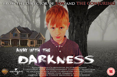
This the final edition of my film poster, i based it on the film poster insidious however the story is completely different. I used a number of different layers to get the right colour effect for the background as i wanted it to look cold and mysterious. I simply drew a rectangle over the whole poster and put it behind all the layers, i changed the colour to blue and because it was a solid colour i used an overlay effect so the background was a blue misty effect.

I chose to use BBFC age certificate '15' because the storyline is quite scary and and i thought it fit with poster and the summary of the film. To get the the BBFC certificate and the film company logos perfect without any white background was simple. For example, i got the warner brothers logo from google and put into photoshop, i drew round the image with the magnetic lasso tool and took away the white background. After this i dropped it into the film poster and scaled it to the right size. I did this with all three of the images on the bottom of my film poster.
I got the font from a website called 'DAFONT' and installed onto my computer. The font looks mysterious and scary and the font is suitable for the film as it fits and it doesn't look out of place. For example the font used for the film 'BACK TO THE FUTURE' is a science fiction font and wouldn't fit this film because it is the wrong genre.
Every film poster has a credits bar so i wrote one myself and included it in my poster.
The image on the left is the a photograph of the character i used to put it in my film poster.
I edited the picture of the boy to make it look scarier but first i took away the white background so i could edit it into the final poster. I used the magnetic lasso tool to draw a line round the character so i could take away the background but leaving behind the main part of the image. I simply deleted the background and dragged the image of the character onto another image. (The main background for the film poster)

No comments:
Post a Comment