Tuesday, 17 December 2013

Evaluation/Film Poster

Film Poster

This is the completed version of my dvd sleeve and the genre of it is a supernatural horror. I analysed a lot of different dvd sleeves to get ideas about how to create one as i started with just a white background. One of the films i drew inspiration from was from the film 'Insidious'. As the film was sold to lots of different regions, there were lots of different dvd sleeves that was created for the same film. So I took ideas from all of them.


For it to be different than the movie poster, i had to put in more information, To make my dvd sleeve look professional and realistic, I had to create features and use different gradient effects. 
To make the background look misty and scary, i used a black gradient effect to make it look darker, on both the front and the back of the sleeve. The bottom of the sleeve had to be darker because the font would have been harder to read otherwise. On the front of the sleeve i used an effect to turn it black and the font was a lot easier to read. On the back of the sleeve i drew a black rectangle over half the page and changed to colour to red. I then used an overlay effect so you could still see a bit of the background. I did this because the credits bar and film companies were easier to see and were really clear, this effect also made the dvd sleeve look quite dark and haunting, which was good as the genre for the film is a supernatural horror.

The hardest and longest part about making the sleeve, was to create the credits bar. I drew different sized rectangles to fit the page and added font to make it look like a real credits bar. It took around 3 hours all together to finish it to a good standard. 
I  had to keep the same format and images from the original movie poster I created earlier on. The images i kept were the main character and the black figure, and also the main title didn't change, i didn't include the image of the house as i felt it looked to much like the insidious poster, and in my opinion i felt the sleeve looked better without it, and there was no where to put it without it looking too much.

I added a quote from a newspaper and I got ideas of the layout for the movie poster I made and the dvd sleeve from the film 'INSIDIOUS' in order for the sleeve and the poster to stay similar.
To improve my dvd sleeve i think i need to replace the image of the character and upload it again. I think this becasue the image is slightly blurred and i have a noticed a white line around the edge of the image which needs removing. However i am happy with the design of the sleeve, and i think it only needs a few more improvements before it can be completely finished.

Monday, 16 December 2013

Evaluation/Magazine Cover


This is the complete version of my magazine cover. I researched ideas by analysing different film magazines to see what the format was like and get an idea of how a magazine is made. I simply typed in 'film magazine covers' and got inspiration from two different film magazines.

On the magazines i analysed, the backgrounds were white, however to get the reader to know i was advertising a supernatural horror film, i had to think of something different.
 The genre of my film is a supernatural horror so i had to make it look i was advertising a horror film. By doing this i used a number of different effects and gradients and added a background. To make it look dark and misty, I dragged the gradient effect from the bottom of the screen and pulled it up about halfway, this made it look like i was advertising a scary movie.

I got the title of the magazine cover from another cover. However i changed the font, size, boldness,and even brought it off the screen by using a drop shadow effect. I got my inspiration from 2 different magazine covers. one called 'EMPIRE' and another one called 'TOTAL FILM'. By putting a drop shadow on the magazine title, it made it a lot clearer and much more effective.
I have used different sized fonts to make it eye catching for the reader, to improve i think i should of made the font a bit more clearer by either a drop shadow effect or use the stoke effect to make it bit bolder.At the bottom of my magazine cover, i have added even more information about what is included with this issue. Like any other magazine, you usually get something free with it to persuade a customer to purchase it, which is why included it.

The character in the middle of the magazine cover as when i analysed another film cover, the character was in the middle. I also thought that by doing this, the text will be clearer and easier to read if its placed down the side of the cover.
Like other covers, i have used three main colours, red black and white. I tried to makes it eye catching for the reader by doing this, as well as it looking professional at the same time.
I tried to keep the same theme throughout creating the cover. I used some of the same fonts from my movie poster and dvd sleeve. I have added an extra font that was called 'code bold'. I took this font from a website called the 'da font',  I needed the right font to fit my magazine cover, and i didn't want it looking to much like a film poster.

Every issue of a magazine has the date, what number issue it is and the date it was published, i added this to my magazine however it isnt very clear to read, to improve it i think the change the colour and the size to make it little bigger.
To improve this i think i need to include images in my magazine, for example, pictures of the what is including in this issue of the magazine, or up coming films that are previewing soon. This will also add a bit more colour to the front cover.

Evaluation/Film Poster

Evaluation

Film Poster

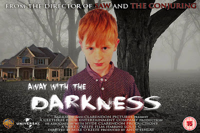
This the final edition of my film poster, i based it on the film poster insidious however the story is completely different. I used a number of different layers to get the right colour effect for the background as i wanted it to look cold and mysterious. I simply drew a rectangle over the whole poster and put it behind all the layers, i changed the colour to blue and because it was a solid colour i used an overlay effect so the background was a blue misty effect.


I chose to use BBFC age certificate '15' because the storyline is quite scary and and i thought it fit with poster and the summary of the film. To get the the BBFC certificate and the film company logos perfect without any white background was simple. For example, i got the warner brothers logo from google and put into photoshop, i drew round the image with the magnetic lasso tool and took away the white background. After this i dropped it into the film poster and scaled it to the right size. I did this with all three of the images on the bottom of my film poster.
I got the font from a website called 'DAFONT' and installed onto my computer. The font looks mysterious and scary and the font is suitable for the film as it fits and it doesn't look out of place. For example the font used for the film 'BACK TO THE FUTURE' is a science fiction font and wouldn't fit this film because it is the wrong genre.
Every film poster has a credits bar so i wrote one myself and included it in my poster.


The image on the left is the a photograph of the character i used to put it in my film poster. 
I edited the picture of the boy to make it look scarier but first i took away the white background so i could edit it into the final poster. I used the magnetic lasso tool to draw a line round the character so i could take away the background but leaving behind the main part of the image. I simply deleted the background and dragged the image of the character onto another image. (The main background for the film poster)


Analysing magazine covers - Magazine Cover 2

Magazine cover 2


This magazine cover advertises one of the Harry Potter films was previewed and new at the time it was released. I found that a lot of magazines use the same colours and have three main colours that they always use. On this magazine the colours used are white, red and yellow. 
I took ideas of the layout of this magazine and created similar formats on my own magazine cover. For example, where it says 'MASSIVE PREVIEW SPECIAL' I took and my put on my own magazine. I think it the size of the font and the boldness uses the space well which is why i used it in my own. I don't think this magazine is as eye catching as magazine cover, however i did
 draw some inspiration from it, to get an idea of how to format my text. 
The main character is slightly been placed to the left rather than to the centre of the cover. However i decided to put the actor in the middle of the front page.
I think this magazine cover is good in the way it has been formatted, however i think more information needs to be included to tell us what is inside.
Even though i know that Harry Potter is an action/fantasy, The image of the character also tells the reader that the film is an action film, this is how the make up has been used on his face.


Friday, 13 December 2013

Analysing Magazine covers - Magazine Cover 1

Magazine cover 1


This is a film magazine that advertises a new film called 'Sherlock Holmes'. I based the format of the magazine cover i made on this magazine. I got the title for my cover from it, but changed the font so it was slightly thinner to make sure i didn't copy it completely. The purpose of this magazine is too advertise the new 'Sherlock Holmes'. Even though on this front page it is advertising the latest film being brought to cinema, by advertising even more even films on the front cover, will attract more people to buy the magazine so they can read reviews on the latest films, and any relevant information
about a film they have seen, or planning to watch.
The main colours used in this magazine are blue, white and black, and The main bold font is blue, and any . To keep the same format for my cover, i used the colours black red and white as my main colours, to fit the theme of the magazine and the film i was advertising.
The image of the actor is in the centre of the magazine, i took this idea and used the photograph of my brother and put in the centre of my cover. However the genre of film i am advertising is a supernatural horror, so i used a gradient effect to make it look it bit more scary.
By advertising Sherlock Holmes on the front of the film magazine tells the readers that this film is 'the one to see' before they even plan to watch it.


Thursday, 5 December 2013

DVD Sleeve/Research

DVD Sleeves.

The format of a dvd sleeve includes more information than an average film poster. Every DVD sleeve is different in their own way but they all contain the basics. For example,  They all include the blurb on the back, snapshots of the film, an age certificate (BBFC), and a credits bar if it isn't  on the front. 


Avatar - The dvd sleeve for avatar has the following, a purpose, audience, reception and consent. The purpose of this dvd sleeve is to try and sell it to the audience that this specifies for, so 'avatar' would be probably target an audience of teenager adults, at the age of 15+. The difference between this and theatrical poster is that it includes more information about what the film is about without giving the whole summary of the film. From the dvd sleeve, you can notice straight away that genre of the film is sci-fi/fantasy film. This is because of the font that is used and the snapshots that are used on the back of the dvd sleeve. On the back of any dvd sleeve, there usually is  bbfc age certifiacte. The fonts are easy enough and clear to read, because of how popular the film actually is, the face on the front of the sleeve is easily recognised before even looking at the main title.
The back of the sleeve is very important as this is what hold all the information about the film. For example, the summary of the film (without giving too much away), what is included in the dvd, such as special features etc. Also what newspapers have said about the film, to persuade someone else to watch it. 
In my opinion i think this dvd sleeve is simple but creative. It is very colourful which is eye catching to to a customer that would walk past it in a shop, i don't think anything should be improved or added to the sleeve. 


Thursday, 7 November 2013

Film Analysis/Titanic

Titanic: 


On the original titanic film poster, there is a  colour contrast between the the font, the characters, the skyline and the ship. The sleeve of Rose's robe is a beige colour, this matches the lines under an over the word "TITANIC", and this matches the top of the ship; the colour used in this poster is clever and used well. 
The main figures that stand out are the characters Jack and Rose, however the ship takes up the majority of the poster is the fact that it is the main setting of the film. In the poster, Jack has his arms wrapped around Rose, showing that the film is a romantic genre, also you can tell the genre of the film is romance by the way the two characters are looking at each other. This shows that there is romance throughout the film and what that the whole film is based on them, the love story between Jack and Rose is used within the film to emotionally connect the viewers to the ship, so that when titanic actually sinks, we the viewers feel more like we are on board, and we don’t want to see any of the characters to die because they were "meant to be";we  form a connection to them whilst watching the film making the film a little more exiting and by having a make believe story in the film makes the film just a little bit more emotional.
The directer James Cameron is known to direct the best films, Where it says "A James Cameron film"   The designer thought it would be important to have this on the theatrical poster, as it shows the viewers because James Cameron is such a  famous and successful director, the film is going to be good.


Film Analysis/The Dark Knight


The Dark Knight:


The use of colour is clever in this film poster. The fire creates an image of the batman logo, the contrast of burnt orange on black attracts the reader's attention. Before looking at the title of the film, everyone knows what it is because of the logo. Everyone knows the film just by having a glance at the logo so the title "Batman" isn't even on the dvd sleeve because it isn't needed.
The release date for the film is at the centre of the bottom of the poster in a large bold font. This shows that the viewers interested to watch this film cant afford to miss it, which is why it is clear and bold. The tagline “Welcome to a World without rules” implies the darkness of the film and how the film represents dark, scary themes of a world where there is no peaceFrom the poster you can immediately tell that this film genre is action. One reason being is that that includes fire and destruction of a burning building. In other film genres like romance, you wouldn’t see bond font, it would include soft font and light colours.

Film Analysis/The Notebook

Film Analysis


The Notebook:

The image of the man and the woman who are the main characters in the actual film are kissing in the rain, so the image itself is quite stereotypical. This is because it shows what a perfect relationship the two have.The soft colours and the image show it’s a romantic film, also from the tagline which reads ‘Behind every great love is a great story’. It uses the right contrast of colours to express the genre of the film.From the use of soft colours and the image of the man and the woman you can immediately tell that this film poster is based on a romantic story.  The poster is simple but gives clear information about what sort of film it is, for a set target audience.


Sub genres/Horror

Exploring a genre

HORROR


There are lots of different types of horror genres like:


Dark Fantasy: contains fantasy elements with a horror twist, or horror with a distinctly fantastical setting, like Stephen King’s Dark Tower series.


Sci-fi Horror: mash-up of science fiction and horror, usually where the sci-fi aspects (aliens, robots, space travel) are used to precipitate the overriding horror. Like in the movie Alien.

Supernatural: can include ghosts, monsters, dark forces, zombies, or pretty much any creepy thing that can’t be found in the real world.

Psychological Horror: driven by characters’ fears and focused more on psychological dread than on murder, mutilation, and gore. Could be supernatural, but is more often associated with those twists where the protagonist turns out to be insane.

Gothic: involves psychological terror in historically romantic settings, usually including mysteries, ghosts, castles, decay, madness, hereditary curses, and death. Pretty much dominated by Edgar Allan Poe.

Suspense/Thriller: does not involve any supernatural or otherworldly aspects, instead relying on real-life situations to generate horror through serial killers, deadly situations, natural disasters, and psychopaths. Good film examples are Se7en and Jaws (even though it’s pretty unrealistic that a shark gets so hung up on eating people).

Weird Fiction: a primarily historical term for fiction of the 1930s, it predates genre fiction and blended the supernatural, mythical, and even scientific into stories that were ultimately strange, uncanny, or unreal in nature. The term is popularized by Weird Tales magazine.

Wednesday, 6 November 2013

DVD Sleeve's/Purpose/Audience/Content/Reception.

DVD Sleeves.

PURPOSE:
The purpose of a dvd sleeve is to try and sell it to the audience the film is specified for. The purpose to sell a dvd sleeve is so that you can watch the dvd more than once without worrying about the same film again. A dvd includes a blurb that tells you a bit more information about what the film is about. From this you can tell what genre of film it is and wether or not the film would interest someone.
                                                                                                                                                         
AUDIENCE:
The audience for a dvd is always different as every film will be for a specific audience. On the back of the dvd is usually has bbfc age certificate that will either say U, PG, 12, 15 or 18. Some people buy films on dvd because it is less expensive than the cinema, and also with a dvd, you can watch it more than once without paying again. Or, people who didn't get the chance to watch the film in the cinema or don't like going to the cinema buy the film on dvd.

CONTENT:
The content of a dvd sleeve includes more information than an average film poster. For example:- the blurb on the back gives you more information than the front. The blurb would usually include the special features, snapshots of the film, an age certificate (BBFC), and a credits bar if it isn't  on the front. The spine of the DVD sleeve usually consists of a holographic picture of just an image of the main character in the film. of the there was more than one dvd like a box set, an image could spread across all the dvd sleeves, but for films it usually has just one image. Somewhere on the DVD sleeve it may have ratings and reviews for example, the daily mail could rate a film 5stars, or the sun could the film 4stars etc.

RECEPTION:
You can  usually buy a dvd supermarkets, or rental shops like blockbuster. You can usually find them shelves right at the front of the shop, and these are usually the the latest films that are out. However not all films can be found in stores, so people tend to buy films they cant find on shops, shop online.


Wednesday, 23 October 2013

Sketch Ideas

Sketch ideas

I sketched ideas of what i want my font to look like and i have a choice of four different fonts that i have drawn. My favourite font is the font on the right hand side, because it looks bold and 'scary' looking where as I think the others I drew looked amateurish. However I will not be created my film poster by hand so the fonts are just different idea of what I actually want. I think the one I will consider is the second font. I think this best suits the theme of the film and will look a lot better on the completed version of my film poster.


The House I drew is just a sketch idea of what I want to include on my film poster. The photographs I want to include on my film poster I will take myself, the sketched image of the house is an idea of what I want the actual house to look like.


Rita Ora


Rita Ora


I chose to use this picture of Rita Ora to use as a template for my graphics work. After first drawing round the face features i began to realise that her hair would be difficult to draw round. It took a long time to to this as all the curls had to be shown.

First i drew round the outline of her hair before starting any detail. The hair was the hardest to complete as i had to think about the amount detail it needed in order for it to look good. Although on the original image, the hair looks all one colour but when i used the pen tool, i realised there were many shades of blonde and  i had to choose a shade of blonde that fitted the colour of her skin. To make her curls stand i used the pen tool to pick a lighter shade of blonde and drew round every individual curl and changed to direction so it was not all falling the same way. It took a lot of time to this, however i did it to make her hair look better, stand out and more realistic.

The face features were easier to draw round as not as much detail was needed. The lips were very simple to get right, as not a lot of detail is needed to make the lips look good. Too make them look realistic i drew a line in the middle of her lips in a lighter shade of pink, this made the lips not all on colour and separates the top lop and the lower lip.
The eyebrows was the easiest face feature to draw round as they a just one shape and only need one colour. The pen tool was used again for this to match the graphic eyebrows the same colour as her actual eyebrows.
To get the shape of her nose, i simply drew a few lines and not completely drew round it. This was due to the fact that the nose look ridiculously stupid when i drew the full things, so i drew in simples lines to to get the shape of her nose.
However, the eyes were the most complicated face feature to get right. A number of layers needed to be used and the shape needed to be as close to the shape as her real eye as possible. To get the perfect shape, a tool called...was used and i managed to curve the lines to make it look rounder and curvier.


Saturday, 19 October 2013

Bitmap/Vector graphics

Bitmap vs Vectors
A bitmap graphic is composed of many tiny parts called pixels, bitmap images are never as good as the quality of a Vector graphic. Vector graphics are created in graphics packages and consist of many different shapes and the difference in graphics between them both are quite noticeable. By enlarging a vector graphic it remains smooth, whereas bitmap images look all jagged and rough as you enlarge them. A Bitmap Graphic is where you scan an image from a magazine or take a photograph using a digital camera, this creates a Bitmap graphic. A Bitmap graphic consists of many pixels which are often many different colours however a disadvantage of a Bitmap graphic is that it tends to lose its quality. An advantage of creating bitmap images is that is very easy to create; by taking a photograph on a digital camera, creates a Bitmap graphic. A main disadvantage of a bitmap graphic is that you cannot make the image bigger without losing quality. The only main disadvantage of a vector graphic is that in order to create a good vector graphic image, you need time and talent in order for it to look good, however I feel it is worth the wait as the quality of the final image is much better. 
In conclusion I believe that vector graphics are much more effective than a bitmap graphic as it doesn't have as many disadvantages; even though vector images are harder to create i feel that the quality of a vector image is much better and has more quality to it. 
264 words


A) Vector Graphic
B) Bitmap Graphic


Friday, 18 October 2013

Exploring Fonts

Horror font
This type font looks like something that should be used as a title on a scary movie. The font is scary and looks as if it has been hand written. I would think that this type of font would be used on a horror film based on films with young people. For example, it reminds me of the film 'Orphan', and 'The Sixth Sense'. Both films include a young main character with a plot thats strange or disturbing. 


Romance font
I chose to use this font as had a 'romantic' feel to it. This type font uses flicks and swirls to make it look girly and romantic. A love heart replaces the 'O' in the word 'Romance', which is why i think it looks like a romantic font. I would use this font for the title on theatrical posters or a dvd cover for either Rom coms or a film about an emotional love story. This font best suits the film 'The Notebook'. This is because the film is an emotional love story, and the word 'notebook' reminds me of a diary, and this font looks hand written which is why i think it best suits the film.


Sci Fi font
This font suggests a genre of sci-fi or futuristic film because the font is used in films such as: 'Star Trek', 'Star Wars', and 'Alien'. These films are all based in the future or have a plots that are science fictional. The font itself is very bold, square and straight, and not like other fonts. This font is only ever used in sic-fi based films, and you never really see them anywhere else.


Action Font
I chose this font as it shows it best suits the genre of action. The title is bold and looks scratched and is suitable for an action film. In my opinion, i think the font would best relate to the film 'THE EXPENDABLES'. 'THE EXPENDABLES'  is an action film, the film includes scenes with explosives and fire and it relates to the font because it looks worn down and battered, as if it has been exploded.


Wednesday, 16 October 2013

Movie Poster Proposal

Movie Poster Proposal

Proposal for Creative Media Production Project

16th October 2013


Summary of content: The story for the film poster i am going to create is about a 15 year old boy who moves into a new town and has to start a new life with his new foster family. ('Thomas Moore' is the name of the boy). Thomas wants to live a normal life but theres something in his life that stops him from doing what he wants to do. This is because of the house he has moved into. Thomas is greeted by a demon that no one else can see. He gives Thomas tasks to complete from the  and it can go to the extreme of murder. Unless Thomas completes these tasks, the demon threatens to kill him. In the end, Thomas completes a number of horrible tasks but he dies because the demon asks Thomas to murder his friend in order to stay alive, but Thomas doesn't do this so he kills himself to get away from it. 

The Summary of style: Although the story is different, i am going to draw my inspiration for my film poster from the film 'INSIDIOUS'. The theatre poster for this was very creative and includes a lot images that it is in film. In order for my poster to be effective, i need to inlclude the right font to match the genre of the film, images that could be invloved in the film such as: other characters in the film, the house he lives, and the main character enlarged at the front. The demon is one of the most important characters in the story so i will have his face somewhere on the front of the film poster, but not so big so all the attention draws onto him.

In order to avoid copyright and Legal and ethical considerations, i need to put an appropriate BBFC age restriction on the front of my film poster. I think the right age certificate for my film is a 15, this is due the film storyline and the characters that involved in the film. To avoid copy write, i will take my own photographs and create my own tag lines, and use appropriate language so i do not upset social groups or infringe laws.

For the working title for my film i was thinking about naming it away with the darkeness'. My ideas for the these titles is because it fits with the storyline and the plot of the film, the character 'Thomas Moore' tries to stay away or try to avoid the demon in the film but other titles maybe better so im not fully sure on what to call it. These are just a few ideas. 

The genre of my film poster is a supernatural horror, i chose this because to create a good poster of this genre, you have to be imaginative, creative and clever in what you put into it. I had a lot of genres to choose from and the four i had in mind were action, comedy, romantic or horror. I chose to make a supernatural horror because the best storyline i came up with was a supernatural horror. 

The intended target audience for the film poster i am going to create is a '15' or '12a'. The reason for this is because supernatural horror films usually contain the images of either ghosts, demons, possessed characters etc. The images used on most supernatural horror dvd cases, are not suitable for children under the age of 12 and the film itself.

Tuesday, 15 October 2013

WONKA BABIES

WONKA BABIES


We were asked to create a title for a film, related to the film 'Willy Wonka and the chocolate Factory', the title we were asked to make was called 'Wonka Babies'. I created my title on Adobe Photoshop, and tried to make the title very similar to the original as if the film 'Wonka Babies' was to be made into a movie, it would have to look similar as it would be sequel. I  made the letter 'W' in the title 'Wonka Babies' to make it look similar to the the font in 'Willy Wonka'. This was very difficult as it took a long time to create as the curve had to look good as well as finishing it in time of the deadline. It took approximately an hour to get the one letter complete to the right standard, and took around half an hour to the rest of the title.

The font for 'wonka babies' is purple because the original film 'willy wonka and the chocolate factory' is also purple. I think the theme of the font needed to be the same, which Is why I created the font similar to the original but not exactly the same.


Thursday, 10 October 2013

What is Film?

How would you describe what a film is to someone who had never seen on before?

A film is a story form or narrative that an audience can sir and watch. There are lots of different types of films ( Fictional and non fictional ) depending on on what you like to watch. There are lots of genres of films to suit each viewer for example: sic-fi, horror, romance, comedy etc. On each film you watch wether you are at a cinema or watching a dvd, there will always be an age certificate. This shows what age you should be to watch a a certain film. For example, most horror films would be aged 15+, which means that if you are younger than 15 then its not appropriate for you to watch that film.

The Expendables movie poster

The Expendables poster


I created my film poster to look like 'THE EXPENDABLES'. 

We used a green screen to take pictures of everyone individually. We had to look serious or hold a prop so in the final picture it will fit the genre of what the film is. We used a green screen because in Photoshop it easier to remove the background than other colours or backgrounds. We could use other colours like white or blue but green is the best colour to use.
After this we uploaded them into photoshop and cut out the green screen so we were left with the person. i used a tool called 'magnectic lasso tool' to remove the background. i then dragged each person into the final image. All the pictures were then scaled to a certain size to look right on the film poster. 


I used a number of different effects to create this film poster as it had to look like it was the real thing. I used an orange tint to make it look more like an action poster and a black effect at the bottom of the poster to blur out the bottom half of the people. 

I googled the background by simply typing in 'war-zone background'. I found one that looked like it was in a battle zone and made the poster look very effective. The film poster looked better with the effect on. I googled the font for the title off a website called 'dafont'. I found a font called capture it which i used to make the title 'The Expendables' look like a war type font, which gives the impression that the genre of the film is mainly about action and war.

To make the film poster look realistic, we had to get a film company logo and an age certificate. I chose to use 'universal' and 'warner brothers' and the bbfc to be a 15. All three of the images had a white background so i had to remove this from the image. By doing this i used a tool called the 'magnetic lasso tool'. I went round the image and deleted the background then dragged into the final poster. Without the white background, each image looks effective and professional.


Wednesday, 9 October 2013

Pre Production Techniques

TV, film, radio & audio, print and photo imaging.

TV


TV is similar in the making of the production with film. Before making a production for TV you need to think of a number of different things. One thing you need to think about is how you are going to be able to fund it. The majority of TV programmes are funded by advertisements, for example ITV. Another thing you need to think about is what the show is going to be about, so cinematography is a huge thing to think about before the production even begins. Story boarding, planning, scripting are what you need to do in order to have a good quality show.  In order to create a TV production, you will also need to think about the target audience, who does it appeal to? Depending on what the TV programme is about, depends on what time the show is on the screens and when it is. For example, if the programme was a game show, then the show would appeal to families so it would be placed on TV screens at prim time, (between5 and 8). Obviously there are other important things in order to make a TV production like, location, casting, equipment and the staff involved.


                                                                                    Film
To make a production for film is very similar in how you would a production for a TV programme. However creating a film would take a longer time to make. To make a good film you will need a producer and a director.
Like a TV programme, you will also need actors and actresses and if needed you will need to find extras. But, before even filming, you need a location and permission to use it. This will involve location agency’s, and for a film you will want to change locations if there specific bits of film you want but sets are created in studios for them to film and can be changed whenever you want. However this would take time so the film company will need to watch closely as it costs a lot of money. This is on major issue for film companies, for example, they could book a location for 3 hours and all the filming has to be done in the set time, otherwise it would cost extra to use the facilities

Radio and Audio
Radio and audio is very different in terms of production to Film and TV. Radio doesn’t need film or cameras, the public just listen to the radio, and the majority of them do in the car. Although, radio is on TV screens but there are no images, most radio shows just have their logo on the TV, but some just have a blank screen. To have a good radio show, the viewers need to know what there listening to. For example the genre of music. XFM is radio station which has the genre of rock, if pop music was to be put on the show, than the majority of viewers wouldn’t be happy so it is important to stick to same genre. Timings are a key issue on radio shows. The public usually listen to the radio when in the car and if the radio present news like car traffic then it needs to be at the right time, also with public news, if the news is out dated or not right, no one will be interested in listening to show. Audio is essential in radio. You need sound for a radio show, for the listeners to listen to it. The majority of radio shows have songs and hit singles; however there are some that are set for an older target audience. Radio 4 is a radio show set for people 40 and over as it includes desert island disk and a lot of interviews about different things. Whereas Radio 1 is set for a much younger audience, this includes the latest tracks and interviews celebrities that have a number one single or song that’s about to be release at the time.

Photo Imaging
Photo imaging are used in lots of different productions but mostly used in magazines, newspapers etc. With magazines and newspapers, you get time deadlines in which the pictures needed to be taken, edited and printed. This normally happens in season time for example, christmas, halloween, bonfire night, etc. All the
responsibility for this relies on the time management. Although a camera maybe the only thing need to capture a photo, there is a lot of equipment used for photo imaging such as: green screens, lighting, camera lenses and data storage. Without all this equipment, the photograph will lack these things. Green screens are used so when editing the picture later, the background can be removed or change to something different. The software in which to do this is called 'Adobe Photoshop' and this is crucial when editing a picture as lots of different things be changed on it.

Print
Print is similar to photo imaging, only print can consist of many different things where as photo imaging is just pictures. When printing something, it has to have an ap
propriate content depending on where it is going or what they are printing. Companies for newspapers or magazines have tight deadlines when printing. Wether it is weekly or fortnightly, the newspaper has to be done correctly, not rushed and to be a good standard to sell to the public. But in order to have good stories or pictures, a contact list is essential and needed when looking for people they need, like photographers. Advertisements are major in print. Every where you go, you will see an advertisement somewhere at some point, wether it be in a shop window or on a billboard. The target audience is important to think about when printing. This is because whatever is being printed has to appeal to that target audience. If it was an advertisement for a show, festival etc. The poster would need the correct information and some sort of age certificate.


INTERACTIVE
Interactive media is when you talk or interact with someone or something. For example a computer game like grand theft auto or an app that guides you through something like learning a new language. Not all computer games are interactive, however consoles like the PlayStation 3 or the XBOX, have games especially made for interaction.